

Cancel Beside the Receipt: What Claude’s Billing Screen Gets Right About Trust
A short field note on subscription UX: when payment history and cancel live on the same settings surface, the product stops treating exit as a threat. Public enforcement cases show how often the opposite pattern still wins — and why openness is the better business design.
In years of buying software, registering products, and paying for subscriptions, one pattern becomes familiar: the receipt lives in one corner of the product, and the way out lives somewhere else — buried, gated, or politely postponed. Then you open a billing screen and see something quieter. Plan. Card on file. Invoice marked Paid. And, on the same page, Cancel.
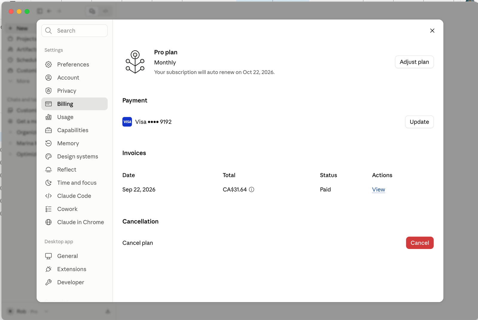
The screenshot that prompted this note is from Claude’s Pro billing settings in the Anthropic product UI. It is a single observed layout, not a claim about every Anthropic surface, every competitor, or every jurisdiction. What it shows is still rare enough to stop a long-time subscriber mid-scroll: the proof you paid and the control to stop paying share the same settings panel. No scavenger hunt. No “contact support to leave.” Receipt beside exit.
“Don’t be afraid for people to walk away. Trust is how you build a business.”
That is the thesis in plain language. Showing a paid invoice next to a clear Cancel control is not a small visual preference. It is a product stance: we will not hide the door because we are afraid you might use it. The rest of this piece is a short, source-backed contrast — three public complaint themes about subscription exit — and a UX reading of why the open layout wins points without needing a feature war.
Three complaint themes (public record)
The themes below are drawn from U.S. Federal Trade Commission press materials and related enforcement actions. They are representative regulatory narratives, not a survey of all users, not a ranking of brands, and not proof of how any one person’s session felt. Where this article interprets design intent, it is labelled as interpretation.
Cancellation is harder than signup
Regulators have repeatedly described “roach motel” patterns: easy in, hard out. The FTC’s case against Amazon alleged that Prime cancellation was deliberately complex — internally compared to an odyssey of steps — so that people who wanted out would abandon the flow. That is not a niche forum gripe; it is a documented enforcement narrative about friction as retention.
Fees and hurdles hide until you try to leave
In 2024 the FTC took action against Adobe and two executives, alleging that early-termination fees were not clearly disclosed up front and that cancellation itself was designed to be difficult — multi-page online paths and phone flows that introduced resistance and delay. The complaint theme is dual: surprise cost plus procedural drag at the moment of exit.
Negative-option subscriptions keep drawing complaints
The FTC’s Click-to-Cancel rulemaking was framed around a simple principle: ending a recurring charge should be as easy as starting one. The agency reported a rising volume of consumer complaints about negative-option and hard-to-cancel practices — nearly 70 complaints per day on average in 2024, up from 42 per day in 2021. The rule itself is policy; the complaint trend is public evidence that exit friction remains a mass experience, not an edge case.
What the Claude billing layout signals
On the observed screen, hierarchy is calm: Pro plan and renewal date; Payment with a masked card and Update; Invoices with date, total, Paid status, and View; Cancellation with Cancel plan and a red Cancel button. Payment proof and exit are peers on one Billing rail. That is the opposite of a retention maze (interpretation): the product treats the subscriber as an adult who can see the ledger and the off-ramp without performing a loyalty ritual.
From a usability lens this maps cleanly to user control and freedom, visibility of system status, and aesthetic restraint. You know what you are on. You know what you paid. You know how to stop. None of that requires Anthropic to be perfect elsewhere, and this article does not claim they are. It claims only that this particular composition is a trust-forward default worth naming — and worth copying.
Why fear of exit is bad product strategy
Teams sometimes defend hard cancel flows as “save offers” or “churn reduction.” Enforcement history suggests another reading: when exit is harder than entry, customers experience the relationship as capture, not value. Capture can pad short-term metrics. It also trains people to avoid the next signup, to dispute charges, and to tell regulators. Open cancel does not mean you stop caring about retention. It means you retain with product quality, not with a locked door.
Put the receipt and the cancel control in the same place. If someone leaves, they leave informed. If they stay, they stay without resentment. That is not soft branding language; it is how durable subscription businesses compound trust.
For YouTube and LinkedIn, the cut is simple: open on the screenshot, name the three public complaint themes in under a minute, then land the line — cancel beside the receipt. The story is not “one company good, everyone else bad.” The story is that transparency at the moment of payment and exit is still rare enough to feel refreshing, and that rarity is a design choice, not a law of nature.
Trust your users enough to show them the door.
The ones who stay will have chosen to stay.
Methodology and limitations
This is a short expert field note, not a usability study and not a comparative audit of all subscription products. The Claude billing description is based on one publicly shared settings screenshot (layout and labels only); it does not document the full cancel confirmation flow, retention offers after click, mobile parity, or regional variations. Complaint themes cite FTC press releases and related enforcement summaries linked below; they summarise agency allegations and rulemaking context, not adjudicated findings about every named firm’s current UI, and not statistical rates of user frustration. No private analytics, no invented quotes, and no claim that Anthropic is free of all subscription friction. Product UIs change; verify against the live settings surface before relying on this description for compliance or competitive decisions.
Sources
- FTC — Final “Click-to-Cancel” Rule (Oct 2024)
- FTC — Action against Amazon over Prime enrollment and cancellation (Jun 2023)
- FTC — Historic settlement with Amazon on Prime practices (Sep 2025)
- FTC — Action against Adobe over fees and cancellation hurdles (Jun 2024)
When was the last time a billing screen made exit feel as honest as the charge? If you design subscriptions, would you put Cancel next to the receipt tomorrow?
We are listening.
Comments (0)
Public to all readers. Only registered, signed-in readers can post.
Want to join the conversation?